
If you haven’t heard Google is really favouring mobile friendly websites and demoting those that aren’t, why? Because now mobile web browsing is taking over desktop browsing! If you didn’t know check your analytics now, you might actually be shocked to find how big the number is. For a couple of years now I’ve offered my clients responsive designs for their wordpress websites but I’ve been so busy with work and personal projects that I neglected my own. Whoops!
That has to change now.
If you are reading this now you’re viewing the new KaijaWeb website, for reference here is a screen shot of the old site. It wasn’t responsive i.e when you viewed it on desktop, tablet or on a mobile device it looked the same only zoomed all the way out to fit the devices screen. This doesn’t make for a great user experience, it makes life very tedious and frustrating.
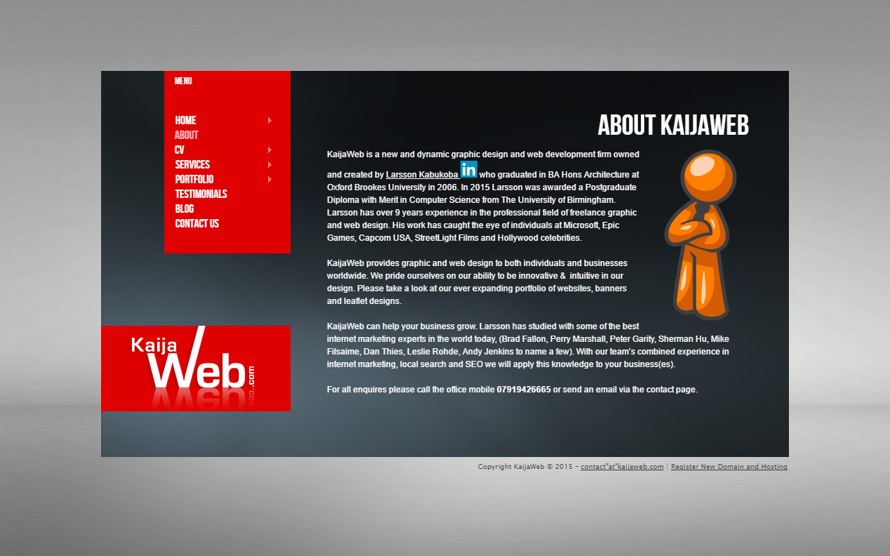
The new site looks pretty cool if I do say so myself 😀 gone are the dark colours, in comes some interactivity. This is still a work in progress, there maybe a couple of aesthetical tweaks here and there. Most of the work will be in the backend, my attention will be mainly focused on page speed. Page download speed is an important factor for any website and this website isn’t quite there yet (you may have already noticed this..).
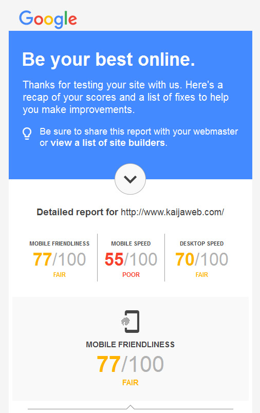

Google recently rolled out their new speed tester www.testmysite.thinkwithgoogle.com, the tool analyses and critiques your website then at the end provides you with a free report advising you on what needs fixing. Here’s my current score, as you can see for mobile there’s some work still to be done. With some tweaking I will get that score up into the 80’s.
Side note: If you are wondering how I made the interactive background (best experienced on desktop), I didn’t, full credit goes to Vincent Garreau who created this wonderful piece of customisable javascript called particle.js check it out.